
This article examines a program written in Swift that creates text-based histogram renderings. The purpose of this case study is to show how such a program can leverage features found in the initial pre-release version of Swift.
The Xcode 6 project reviewed here can be found on Github:
https://github.com/ijoshsmith/Swiftogram
In-depth information about Swift is available from Apple:
https://developer.apple.com/swift/
For general information about histograms, refer to this page on Wikipedia:
http://en.wikipedia.org/wiki/Histogram
Note: All class members prefixed with an underscore in this codebase are considered private. At the time of this writing, Swift does not yet support access modifiers like private and protected.
This code was compiled and tested against Xcode 6 Beta 5.
Overview
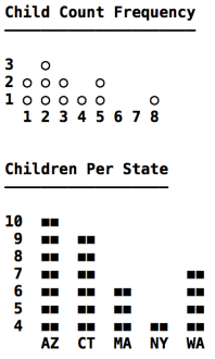
The program, named Swiftogram, is an OS X command line tool. It includes a data set with records that represent parents, including how many children they have and in which US state they live. Swiftogram creates two textual histograms based on records in the data set. All labels and values in the histograms are calculated and arranged dynamically, as if the data set could contain different records every time it is accessed. Here is a screenshot of both histograms.
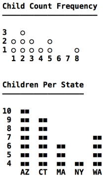
Child Count Frequency histogram
Description: Depicts how many parents have the same number of children.
X Axis: Represents how many children a parent has. It ranges from the smallest to the largest number of children per parent.
Y Axis: Represents the number of occurrences of a child count on the X axis. It ranges from the lowest to highest number of occurrences of a per-parent child count.
Children Per State histogram
Description: Depicts how many children live in the same US state.
X Axis: Represents a set of US states.
Y Axis: Represents the number of children living in a US state. It ranges from the lowest to highest number of children per state.
Points of interest
- The X axis can contain either a continuous range of integers or a discrete set of strings.
- A numeric axis can include numbers for which there are no corresponding data values, such as 6 and 7 on the X axis of the Child Count Frequency histogram.
- A histogram’s column and inter-column gap widths vary based on the width of the X axis labels.
- Y axis label text is right-aligned.
- The character used to draw columns is configurable.
API Usage
The main.swift file uses classes reviewed in the rest of this article.
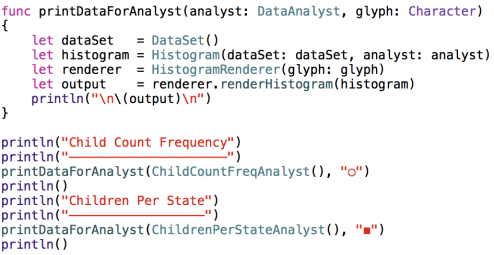
As seen above, each histogram’s data is provided by a DataAnalyst object. Let’s now turn our attention to that portion of the codebase.
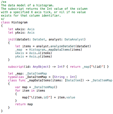
Data Analysis
The DataSet class contains hard-coded dictionaries with information about parents and their children.
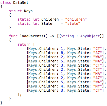
In a real-world program this data would be retrieved from a server or perhaps pulled out of a local SQLite database. The point is that the data analysis code must treat this data generically, and not assume it knows what data exists. Here is all of the data analysis code in the program:
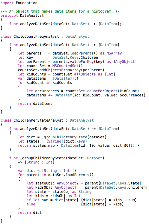
The ChildCountFreqAnalyst class uses NSArray’s support for the valueForKey: method, which is part of the Key-Value Coding (KVC) API, in the Foundation framework. It also uses NSCountedSet to tally up how many occurrences of each number of children per parent are found. This shows how Swift can easily make use of Foundation classes without needing to introduce Objective-C interop to the project.
The last line of ChildrenPerStateAnalyst’s analyzeDataSet method uses the trailing closure syntax when calling the map method. There is no need to use function call parentheses if a method’s one and only parameter is a closure. The closure used by the map method makes use of the shorthand argument name $0 for the closure’s first parameter, which in this case refers to a String that contains a US state abbreviation. The map method returns an array containing a DataItem object for every US state in the data set.
The DataItem class is shown below:
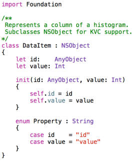
The nested Property enum will be seen again in the next section, when constructing a histogram’s axes.
Modeling a Histogram
A histogram consists of an X axis, a Y axis, and a set of columns.
An axis has an ordered list of ticks, each of which is associated with an integer or string value. Each column is uniquely identified by a tick on the X axis and has an integer value that represents the Y axis tick to which it extends.
Every column must have an associated X axis tick, but not every numeric X axis tick must have an associated column. This can be seen in the Child Count Frequency histogram (shown above) which does not have a column for the 6 and 7 ticks on the X axis, because no parent in the data set has six or seven children.
Here is the code that represents an axis.
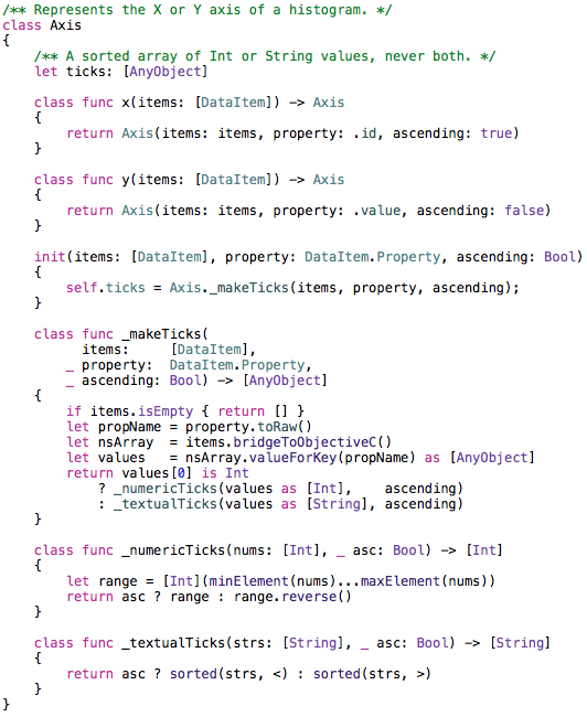
The _makeTicks method uses KVC to grab a property value from every DataItem in the items array. This makes use of the DataItem.Property enum seen earlier. The toRaw method is called to get the underlying String of the enum value, which in this case is the name of a DataItem property (id or value).
Notice in the _numericTicks method that an Int array is created ranging from the lowest to the highest value in the nums array. If the numeric ticks must be in descending order, the array’s reverse method is used.
In the _textualTicks method it is necessary to perform a sort no matter which sort order is needed, since there is no guarantee that the incoming String array is already sorted. The terse sorting code in that method is made possible thanks to Swift’s support for operator functions, such as the < and > operators that compare two String objects.
Rendering a Histogram
Now that we have a histogram data model populated with data items created by a data analyst, let’s turn our attention to creating a visual depiction of a histogram. The Swiftogram application renders histograms in an ASCII art style, meaning it creates a multi-line string that crudely approximates a histogram. The data model is generic enough that it could easily be reused to create a graphical rendering, perhaps with Core Graphics, if that tickles your fancy.
The following screenshot is a reminder of what the histograms look like. Note that the underlined headers are not part of the histogram rendering, those are printed separately in the main.swift file.
An axis is rendered as a set of labels, either numbers or strings. The labels on an axis must all be the same width (i.e., same number of characters). As seen on the Y axis of the second histogram, the text in a label is right-aligned. This ensures that all numbers on the Y axis less than ten are rendered in the ones column, which makes it easier to read. Creating labels for an axis is handled by the AxisLabeler class.
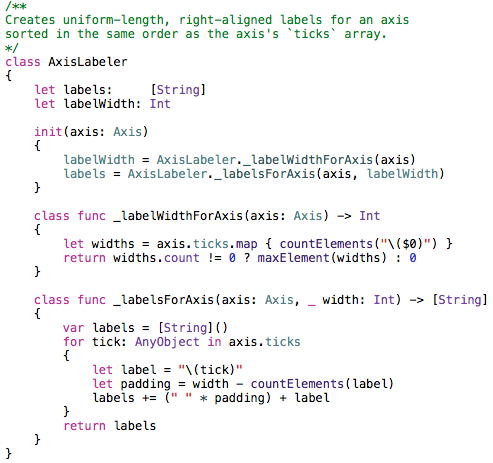
The _labelsForAxis method seen above uses a convenient shorthand for creating the whitespace needed to right-align a label’s text. It looks like I’m multiplying a whitespace character by the number of spaces needed to right-align the text. A similar * operator function is used by the TextPalette class, which constructs strings used when rendering a histogram.
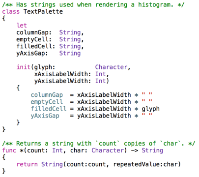
Rendering a histogram involves using two AxisLabeler objects (one per axis) and a TextPalette. In order to avoid having many methods with long repetitive parameter lists, I made a RenderContext class that creates and exposes all of the commonly used rendering objects.
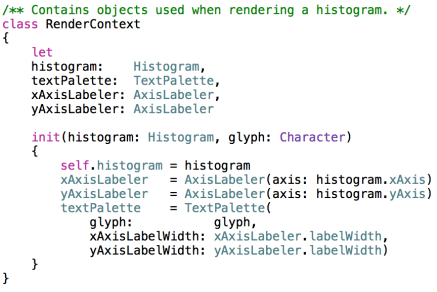
An instance of RenderContext is created by HistogramRenderer before initiating the render process.
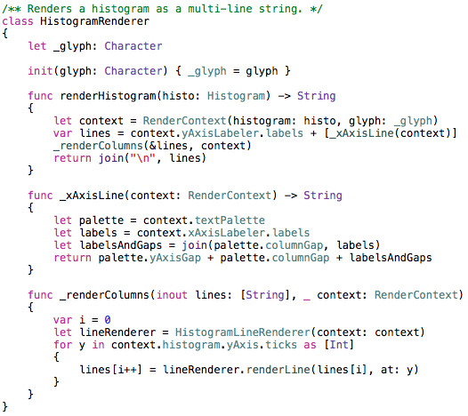
Once a RenderContext is created the renderer makes a String array that contains a line for every Y axis tick and one line for the entire X axis. Then a HistogramLineRenderer is used to populate each Y axis line.
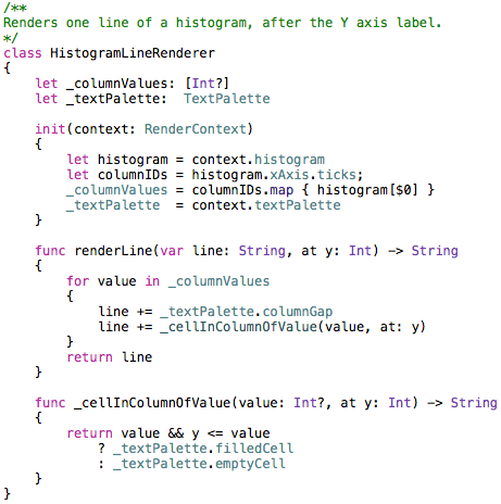
Each line above the X axis in a histogram contains a set of “cells.” A cell’s width is equal to the width of the X axis labels. It can contain either the glyph used to draw a column or whitespace. The gaps between columns are always whitespace. Once all of the lines have been filled with glyphs and whitespace, they are joined together with newlines and returned by the HistogramRenderer.
Lessons Learned
I learned a lot about Swift while writing this program. The language has several features, such as excellent closure syntax and operator functions, that make it easy to write concise yet expressive code.
It quickly became apparent that a class’s initializer(s) often must rely on type methods (as opposed to instance methods) to create the values for non-optional properties, unless you’re comfortable having large, sprawling initializers. This is because the compiler won’t let you call an instance method until all of the object’s properties have been assigned.
The built-in collection transformation methods, such as map, are extremely useful. When used with trailing closure syntax these methods provide an elegant way to perform a lot of work with little code.
Swift looks very promising!
The Xcode 6 project reviewed here can be found on Github:
https://github.com/ijoshsmith/Swiftogram


Pingback: Dew Drop – June 16, 2014 (#1798) | Morning Dew
Pingback: Michael Tsai - Blog - Swift Links